/
Game Changers

Game Changers

Fixing the “double coincidence of wants” in board game trading.
Mobile
Concept
Research
Role

Product Designer

Timeline

9 months

Type

0→1 mobile concept (academic)

Team

5 designers at the start, 4 at the end

Methods

Desk Research · Competitor Benchmarking · User Interviews · Personas · User Flows · Hi-fi Prototype · Usability Testing

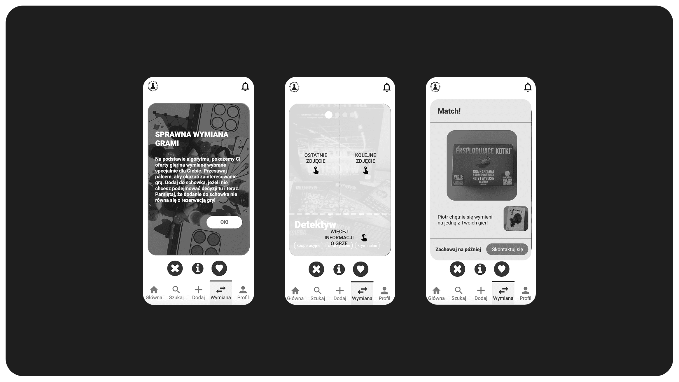
Game Changers hero: “Trading fails when I need what you have — and you need what I have.” with the swipe deck and match screens

The match screen: the moment the algorithm finds a trade two people would never spot.

Overview

Trading fails when I need what you have — and you need what I have.

A five-designer team (four by the end), nine months, one question: can an algorithm untangle the trades that board game collectors fail to make on forums? We designed a mobile matching app built on “shelves” (what you offer) and “wishlists” (what you want) that surfaces trade opportunities people would miss, removing the manual hunting through forums and Facebook groups.

My share of it. Strategy first: desk research, competitor benchmarking, some of the interviews, and the personas that came out of them; then the value proposition, the business model, the KPIs, the touchpoints and the roadmap. Then the design itself: user flows, wireflows, the prototype, and the usability testing that sent me back to change it.

Problem

The matching nightmare.

Board game enthusiasts treat their collections like rotating libraries — games come in, get played, and should move on. But trading is painful because of the double coincidence of wants: I need what you have, AND you need what I have. Finding a direct trade partner on forums is statistically unlikely and disorganized, so most collections just sit still.

Problem image

The status quo: forum threads and Facebook groups doing an algorithm's job by hand.

Key decisions

Match the trades. Fix the words. Add the right friction.

Decision 01 · Core loop

Automated exchange logic: shelves and wishlists

Instead of users manually hunting for partners, the system matches shelves (what you offer) against wishlists (what you want) — surfacing trade opportunities that a human scanning a forum thread would never spot.

Decision 1 image
Why

The core problem is combinatorial — the double coincidence of wants — and combinatorial problems are what algorithms are for, not forum threads.

Trade-off

Automating the match takes the search out of the user’s hands: the system decides what you see and when, one card at a time. Testing found the cost immediately — people were afraid a stray swipe would lose them a game they wanted, and several never realised trading lived behind the swipe at all. We softened it with a save-for-later button rather than dropping the mechanic, because the algorithm’s whole value is spotting combinations a person scrolling a list would never assemble.

Decision 02 · Language

Renaming “Match”: the semantic pivot

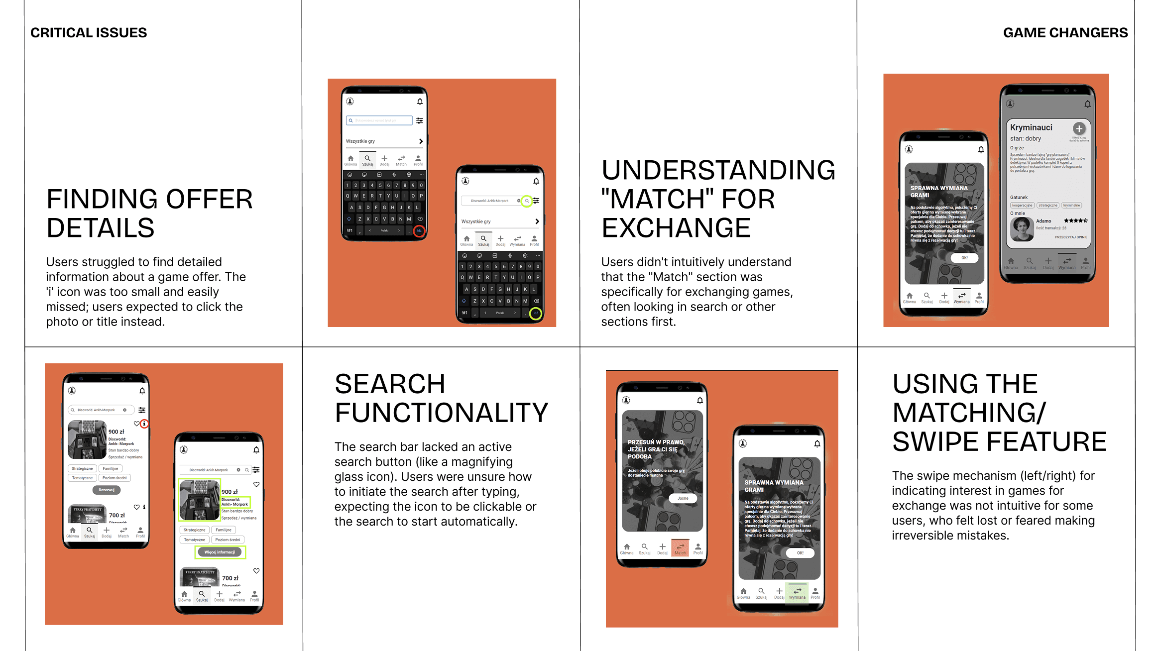
Usability testing exposed a flaw no wireframe review caught: users hesitated at the “Match” button, reading it through the lens of dating apps. Renaming the action to “Exchange” and “Buy” to “Reserve” realigned the interface with the user's actual mental model: a safe, non-binding negotiation between collectors.

Decision 2 image
Why

Usability testing: users associated “Match” with Tinder, not trading. The words were fighting the mental model.

Trade-off

“Match” was the more energetic word, and it described the mechanic honestly — the screen does behave like a dating app. Renaming it cost that: the label now names the outcome while the interaction still works like the thing we stopped naming. I took findability over character. When the core feature is the one users can’t locate, that isn’t a close call.

Decision 03 · Trust

Trust-first design: intentional friction

Research showed that for collectors, game condition matters more than transaction speed. So the “add to shelf” flow asks for the game's condition, whether it comes with sleeves or expansions, and gives six photo slots before a game is listed. The friction is the feature: it bridges the trust gap in trading with strangers.

Decision 3 image
Why

Research: condition outweighs speed for collectors; trust is the real currency.

Trade-off

Listing takes longer. Condition, extras and photos come before a game goes live, deliberately.

Outcome

Eight moderated usability tests, twelve problems, and a rename that made the core feature findable.

8

moderated usability tests — six remote, two in person

12

problems found: 4 critical, 5 significant, 3 minor

Match → Exchange

the rename that made trading findable

“The idea is interesting, good — innovative, because nobody has actually pulled this together. There’s no app dedicated to games, for both swapping and selling.”
— a usability test participant, May 2022

Between 15 and 22 May 2022 we ran eight moderated usability tests — six remote over Google Meet, two in person in a library — on an Axure prototype running on an Android phone. Participants came through a screener posted in board game trading groups: regular players, collections over ten titles, all already buying and swapping second-hand. Eight took part, seven men and one woman, each picked for how closely they matched the primary persona.

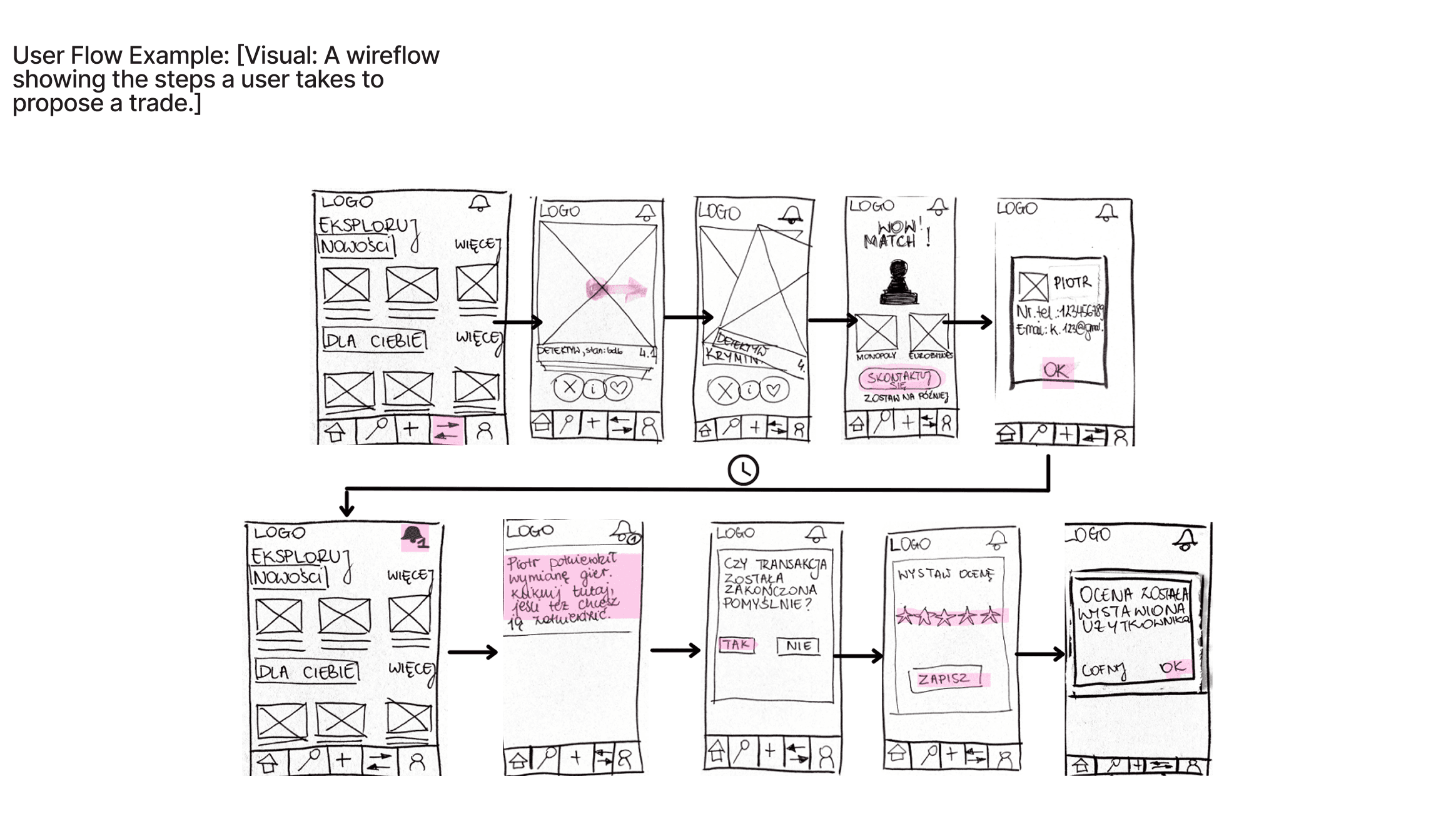
Twelve problems came out of it, ranked by severity: four critical, five significant, three minor. The critical ones were all the same kind of failure — people could not find the core action, or could not trust it. They did not realise that trading happened in the section labelled “Match”. They could not open an offer before reserving it, because the “i” icon was too small to notice. They tried to search by tapping a magnifier that was not a button. And they found the swipe ambiguous, afraid that a stray thumb would lose them a game for good.

All of it went back into the prototype. “Match” became “Exchange”. The reserve button on the results list became “More information”, and the cover image and title became tappable. The magnifier became a real search action. Swipe got a sensitivity fix and a save-for-later button, so a decision could be postponed instead of forced. The transactions screen lost its dropdown in favour of one “Complete transaction” action that only activates once both sides confirm.

What this project does not have is a market. Nine months, academic, ending at a tested prototype — no launch, no downloads, no transactions. The KPIs we defined (successful transactions, matches proposed per user, session frequency) were never measured, because there was nothing to measure them on. What the testing did establish is narrower and real: every participant wanted one tool that handled both selling and swapping, and nothing on the market did that. The idea held. The first interface we built for it had four things badly wrong, and we found them before anyone would have had to live with them.

Reflection

What I would change happens before the sessions, not after: a prototype with more than one route in.

The thing I would change happens before the sessions, not after. Our prototype had exactly one route to the information each task needed. So when people failed the matching task, we could not cleanly separate “this is confusing” from “we only built one way in, and you did not take it” — our own report says as much. A single-path prototype makes a usability test measure the prototype’s gaps as if they were the user’s.

The second is the shape of the project itself. Five designers and nine months produced a strategy layer — value proposition, business model, roadmap, KPIs — that nothing ever tested. The KPIs in particular were written for a product that would need real users to mean anything, and it never got any.