/
TMS Ecosystem

TMS logistics ecosystem

A road-freight operator matched hundreds of trucks to a constant stream of offers in people's heads, Excel and email. Four years and five apps later, the desk works inside the system instead of around it.
Web
Mobile
B2B
Logistics
Role

Product Designer 2022–2025 · Design Lead since 2026

Timeline

2022–2026

Scale

~500 trucks on the road

Surfaces

6 apps · 5 in production

Team

2 designers · 1 PM · 11 developers (1 mobile) · 2 QA

Methods

Shadowing Users · Stakeholder Interviews · Information Architecture · Design System · Design Mentoring · Visual Identity

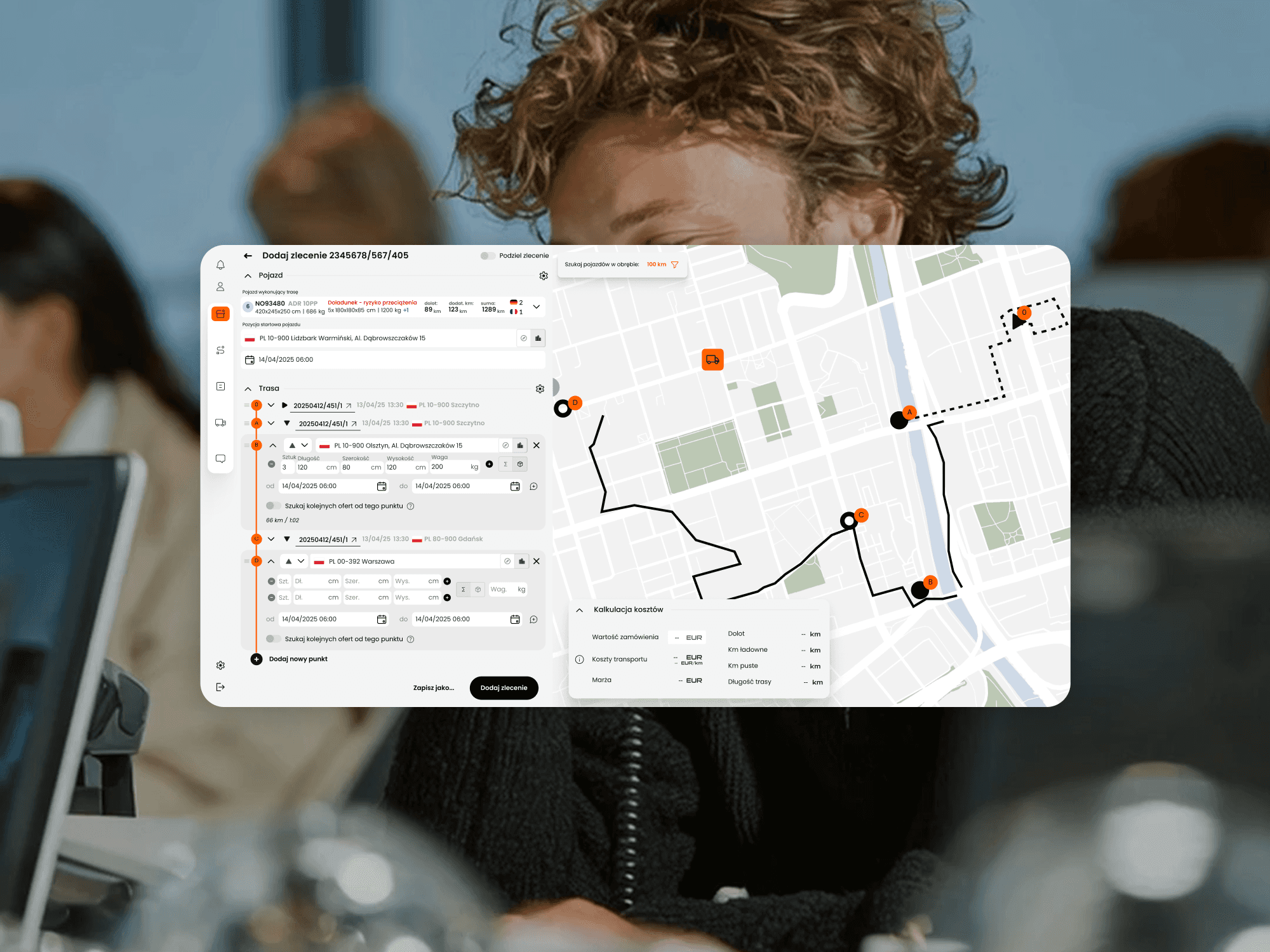
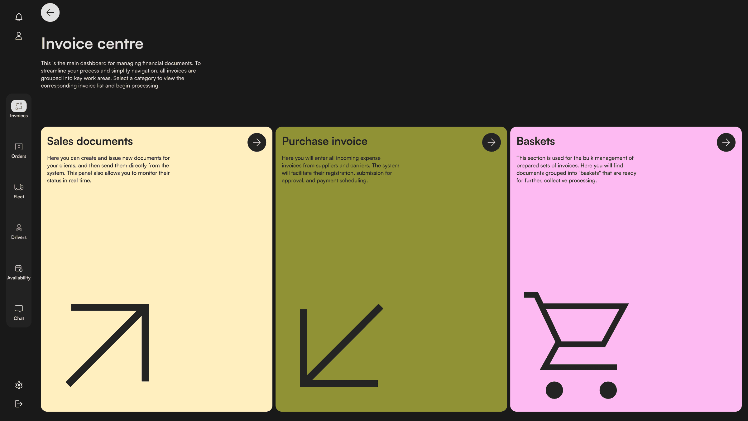
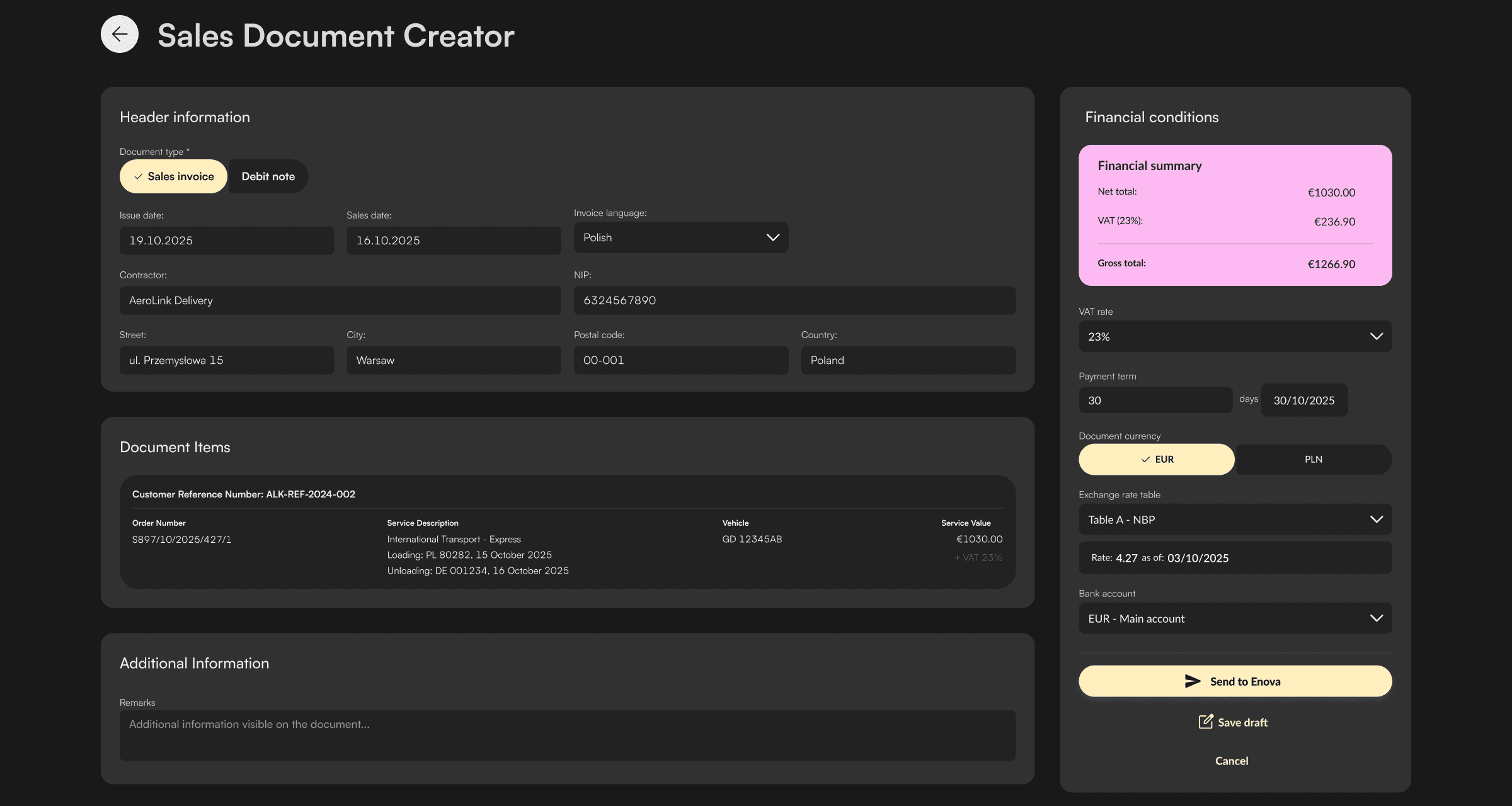
The forwarder web app — the centerpiece the other surfaces feed.

Overview

Five apps in production and a sixth launching, for a European road-freight operator. I joined in 2022, six months after launch. The four years since are mine.

I joined this project in 2022, six months after the first app went live, as the team's junior designer. The client is a European road-freight operator. The work is time-sensitive and heavily regulated: customs, cabotage, tachograph rules, KSeF e-invoicing, several currencies across borders. Over the next four years I ran research, information architecture and design for every new surface and feature. In June 2026 a second designer joined, and I lead the design side of the product.

Four years inside one operational product left me with three working rules. They come from specific decisions, and the sub-case-studies below show each of them:

  1. Automate the repetitive work and keep a human checkpoint. Every automation in this system passes through a person before it leaves.

  2. Treat a migration as a chance to redesign. A legacy flow is a starting point, not a requirement.

  3. Treat new regulation as a feature trigger. The tachograph law became load-to-load matching. KSeF shaped how surcharge baskets work.

The apps

Six surfaces, six case studies. Start with the forwarder app, the screen the whole company works in. The back office is where the client proposed removing the human checkpoint and the design held it. The driver app is where I audited three years of my own work in 2026 and rebuilt its foundation.

Problem

Hundreds of trucks, a constant stream of offers — and the matching between them happened in people’s heads, patched together with Excel and email.

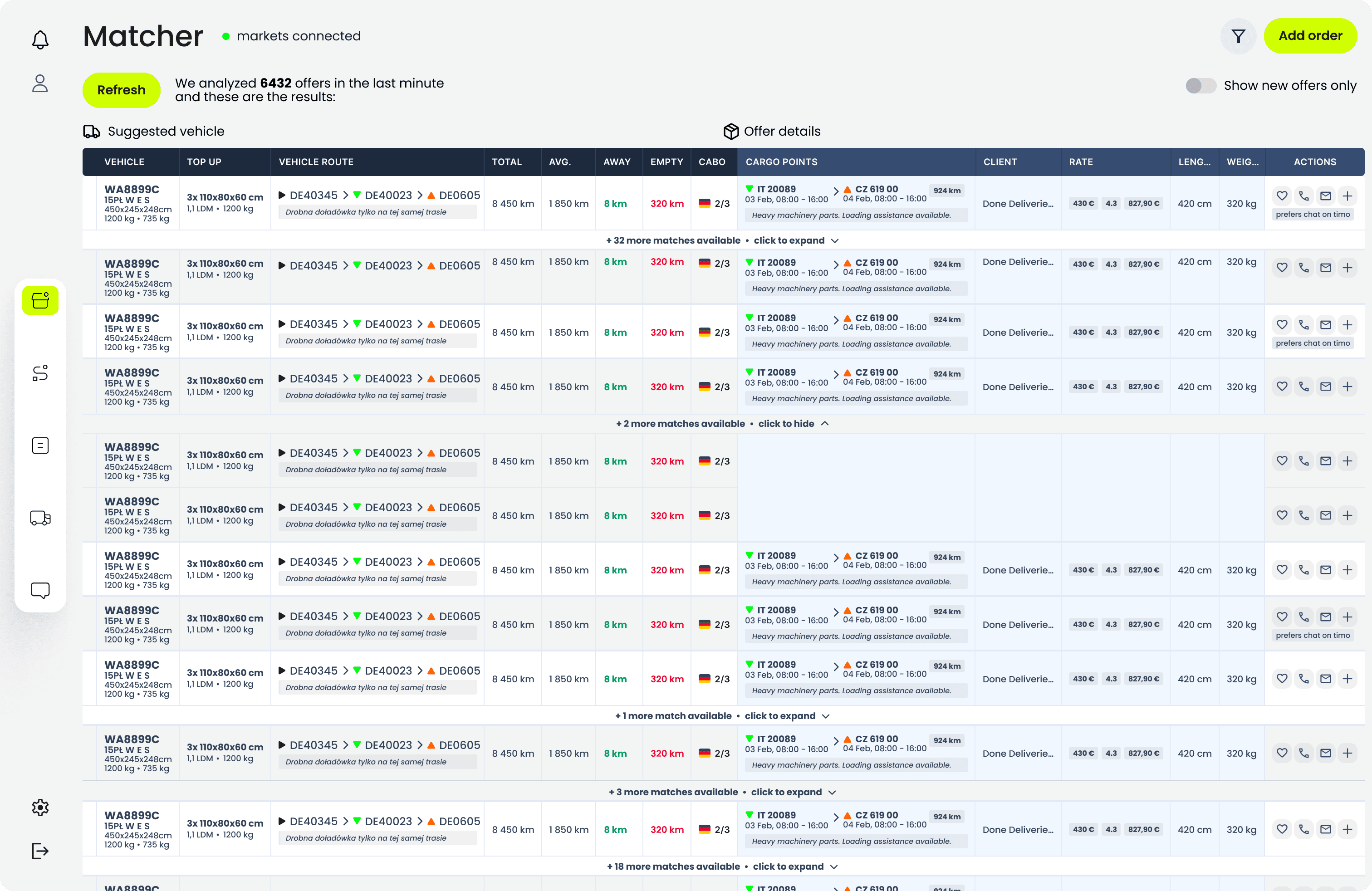
The core problem was scale. Around 500 trucks and a constant flow of freight, orders from clients and offers from the public exchanges, matched by hand. A legacy TMS existed, but forwarders worked around it: they sat directly on the freight exchange and typed the decision into a row after it had been made. That is how the desk ran, under pressure, in dialogue with drivers and carriers. Working around a system has a price. A dispatch desk out of sync with the road costs real freight: empty kilometres, late penalties, cancelled lanes.

The brief was to build the TMS this team would work in, instead of working around.

Problem image

One line per role: who feeds the forwarder, who the forwarder feeds.

The ecosystem

Six apps in four years did not happen in one go. Each shipped in response to a gap the previous one could not close.

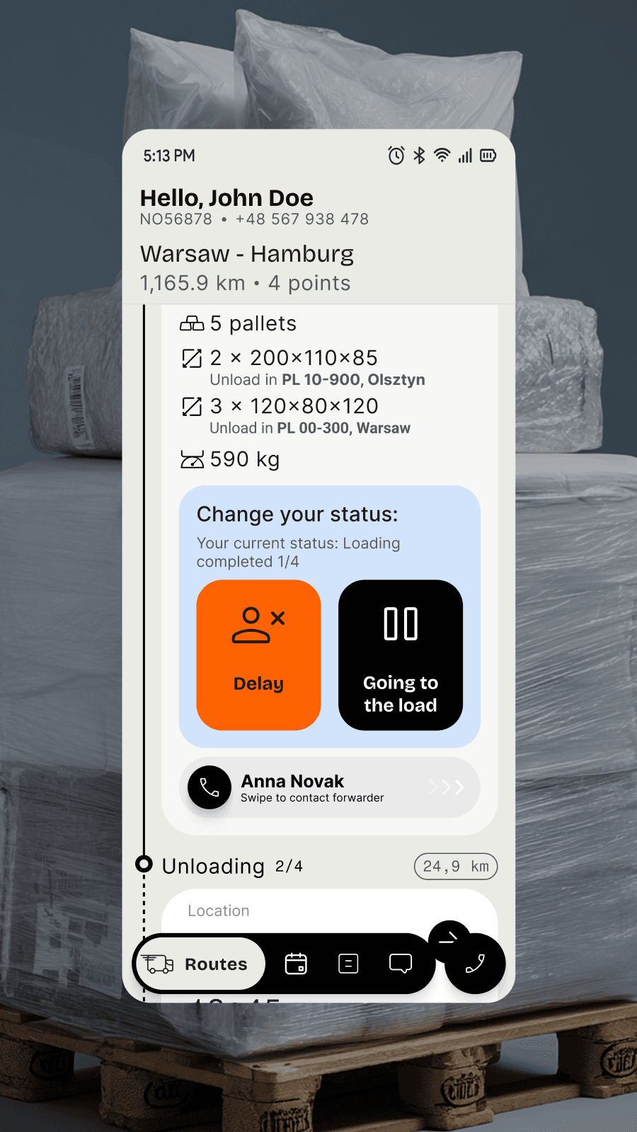
One product, six surfaces: a web app for forwarders and planners, the desk-bound users running the dispatch floor; a mobile app for forwarders and dispatchers sized to after-hours use; a driver Android app, the data feed from the road; a back-office web app for settlement and invoicing; a carrier portal for external partners; and, from 2026, a client portal for the firms that order the transport. Each surface is sized to its user's context: dense for the desk, minimal for the road, and the carrier portal deliberately narrow, because an external party should see only what is theirs.

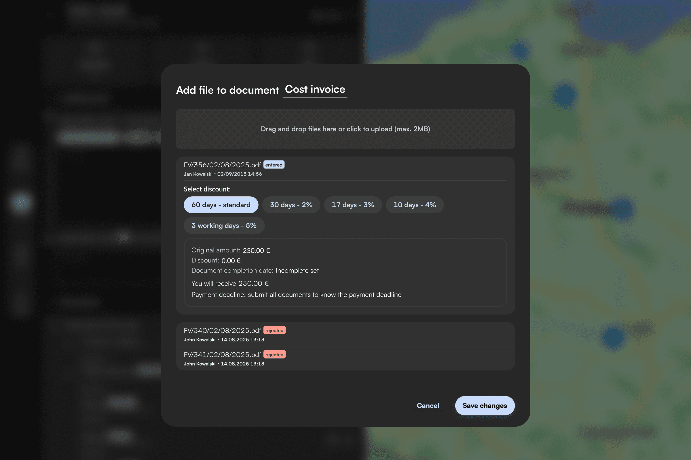
Every screen in this system either serves the forwarder or feeds them. The forwarder catches orders, judges whether a lane is profitable, and commits the company to it. The planner sequences routes one to three days ahead, a role that did not exist when I started and emerged as the client scaled. The dispatcher holds the live link between drivers and the desk. The driver feeds the system events from the cab. The back office closes the financial loop from surcharge to invoice. The carrier receives the load and, later, the surcharge basket that pays them for it.

2026 was the densest year: load-to-load matching, surcharge baskets, and the client portal. In June a second designer joined, after four years of design being a one-person job. I ran her onboarding on the domain notes I had built over two years, and we divided the six surfaces between us.

Section image

One line per year, one surface per line.

Key decisions

Two decisions belong to the ecosystem itself. The deep work lives in the sub-case-studies.

Decision 01 · The ecosystem

Separate surfaces sized to context, not one app for everyone

The alternative was one big app with role-based permissions: cheaper to build, easier to maintain. The ecosystem went the other way. Each role got a surface sized to its context of use. The forwarder gets density: dozens of fields, fixed row heights, everything visible at once. The driver gets a glance-and-tap Android app that works offline in a tunnel. The forwarder on a Sunday call gets a minimal mobile mirror of the web app. The external carrier gets a narrow surface that shows only what is theirs. Same data underneath, different products on top.

The driver app shows how far context-sizing goes: designed with no direct access to drivers, through dispatchers and forwarders as a proxy. Its case study, and the carrier portal's, are in the block above.

Decision 1 image
Why

One app for everyone means everyone gets a compromise. A driver glancing down mid-route and a forwarder comparing thirty rows have nothing in common but the data.

Trade-off

Six surfaces cost six roadmaps and six release trains. Features land on one surface later than users of another would like, and power users sometimes hit a missing module on mobile and open a laptop. Accepted: every module added to a small surface taxes the ones that earn it its place.

Decision 02 · The system

One design system for the desk, separate ones for every other context

The same context-sizing argument runs one level down, into the systems the surfaces are built from. Four of them serve this ecosystem.

One system covers the three desk-bound web surfaces: the forwarder app, the back office and the carrier portal. They share primitives: dense tables, long forms, data compared at scale, fixed row heights that have to survive a new column every quarter. A pattern proved on one of them is worth having on the other two, so the system pays for itself three times.

Everything else got its own. The driver Android app and the forwarder mobile app are glance-and-tap interfaces used one-handed, often in motion, sometimes offline. They share almost nothing with a screen where someone compares thirty rows, and building them from desk components would mean inheriting the wrong defaults and overriding them everywhere. The client portal is separate for a different reason: it faces the customer, carries two brands and four languages, and its visual decisions belong to a brand the internal tools do not share.

What it costs to skip this layer, I measured on our own product. The driver app was the one surface never given a system. When I audited its Figma file in 2026 it had no token layer, a core card rebuilt by hand on nearly every screen, and status text failing contrast. The driver app case study has the numbers. Rebuilding it took weeks; a week of foundation in 2023 would have prevented all of it.

Why

Components inherit the assumptions of the context they were designed for. Force one library across a dense desk app and a one-handed cab app and half the defaults are wrong on any given screen. A designer overriding defaults on every screen has a style guide, not a system.

Trade-off

Four systems mean four places to fix the same thing. An improvement to the web system does not reach the driver app, and nothing stops the surfaces drifting apart in the details. I took the divergence over a shared library that fits nothing well. The cost is real and it grows with every surface added.

Outcome

Five apps in production, four years of daily operation, and the 2026 features extend the system rather than patch it.

300+ hrs

saved per employee per year, client's figure

30s → 5s

to judge an incoming offer, client's figure

70%

fewer “where are you?” calls from drivers after the driver app, client's figure

180k+

orders a year running through the system

“They don’t know how they ever managed to work in Excel before. This TMS — this is it.”
— a forwarder, during shadowing

Three of the numbers above are the client's: the hours saved, the drop in offer-analysis time, and the fall in phone calls after the driver app launched. They ran the operation and they did the counting. I report them as their figures.

Load-to-load matching and surcharge baskets, the two 2026 features, are designed and in pre-launch. Their sub-case-studies say what is known and what is not yet.

Reflection

What I'd do differently after four years: get to the end users sooner.

I came in implementing other people's decisions. I leave 2026 having taken two features from problem statement through research to implementation, and leading the design of the product.

The one thing I would change across all four years is the route to users. For most of that time I learned the domain through the client, who had been a forwarder himself and knew the work well. That was a sharp channel, and it was one channel with its own opinions. Shadowing sessions came later and changed decisions. I would have pushed for them from the first year.