Restaurant point-of-sale
scroll
Restaurant point-of-sale
Sole Product Designer High-Churn Environment • Legacy Tech Debt
Stopping client churn by transforming a clunky 90s tool into a touch-first experience.
As the sole product designer on this project, I was responsible for the complete redesign of an outdated, PC-native Point-of-Sale (POS) system being used inefficiently on iPads. My goal was to transform a cluttered interface into a modern, touch-friendly solution that delivered direct value by boosting staff efficiency and improving user satisfaction.
Designed for Desktops, Used on iPads.
The core business problem was high client churn. Our client came to us saying their customers, who run restaurants, were leaving for competitors because their point-of-sale product felt old and chunky. The root cause was technical: the product was designed in the 90s for desktop computers. But today's waitstaff and managers were using it on iPads by 'mirroring' the old desktop app. This created a terrible user experience, and we saw staff creating all sorts of frustrating workarounds. So, the project had two goals: For the user: Give waitstaff an intuitive, touch-first tool that actually helped them do their job faster, instead of frustrating them. For the business: Stop the client churn by delivering a modern, competitive product that restaurants actually wanted to use.
From "Chunky" to "Competitive"
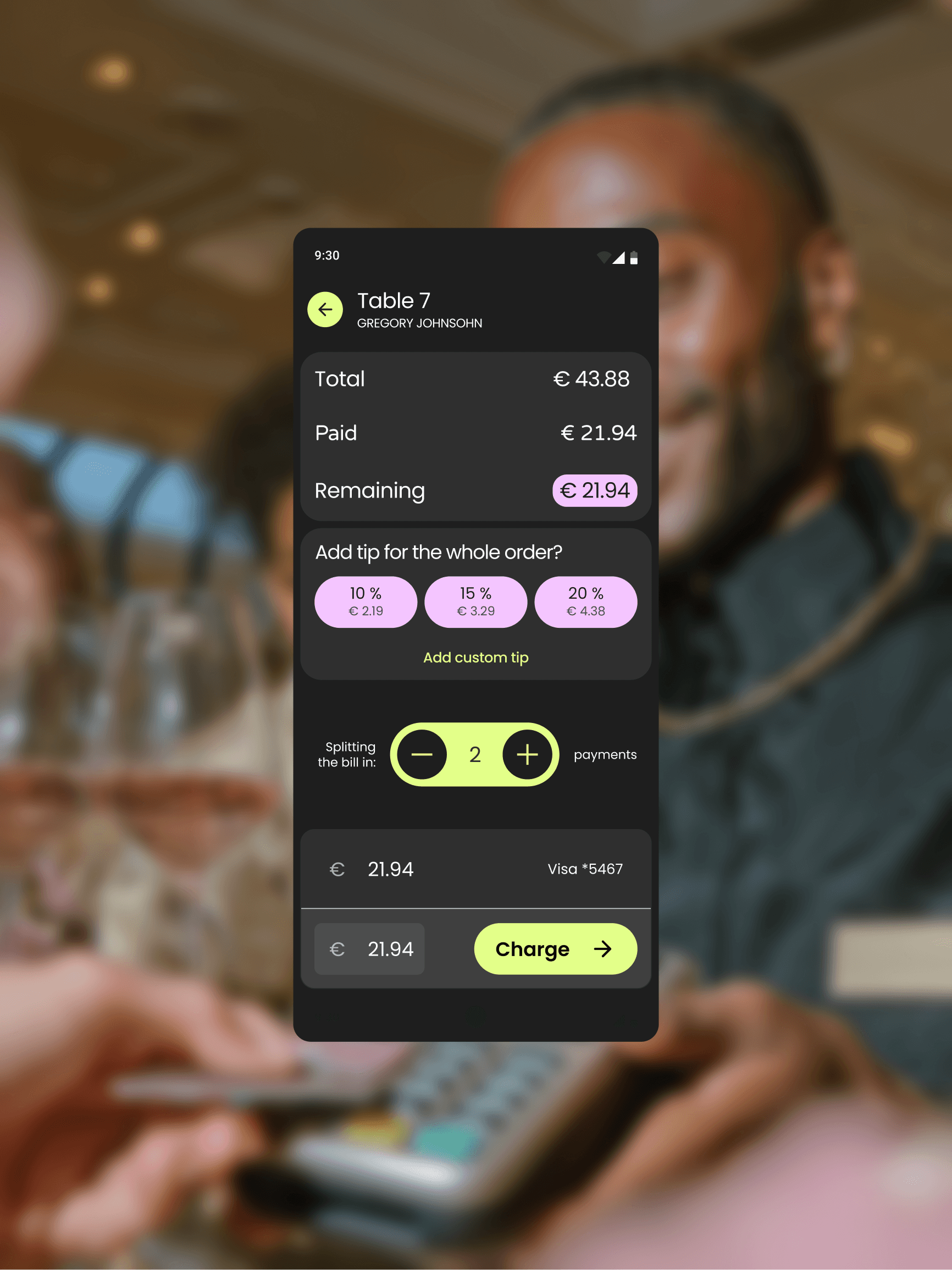
Speed: 30% reduction in average "Time-to-Order" for complex tables. Sentiment: "Significantly less stressful during peak dinner rush" (User Feedback). Business: Successfully halted churn by delivering a modern, competitive iPad experience.
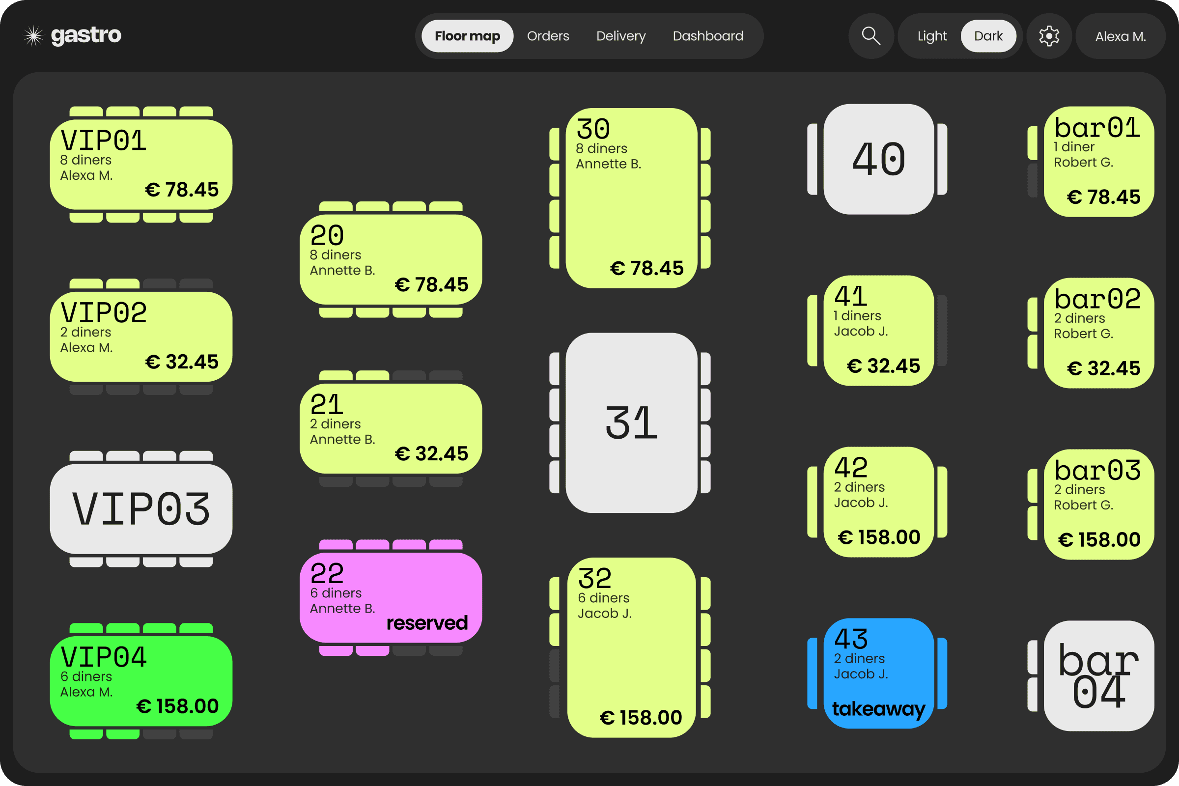
Designing for Chaos: The "Dynamic Ticket"
My field research revealed a critical disconnect: The old system forced a linear path (Table -> Seat -> Drink -> Main), but real-world ordering is non-linear (Mains, then Drinks, then "Actually, cancel the fries"). I scrapped the "Wizard" and designed a flexible "Dynamic Ticket" architecture. Waiters can now add, edit, or re-group items in any order, mirroring the reality of a human conversation.
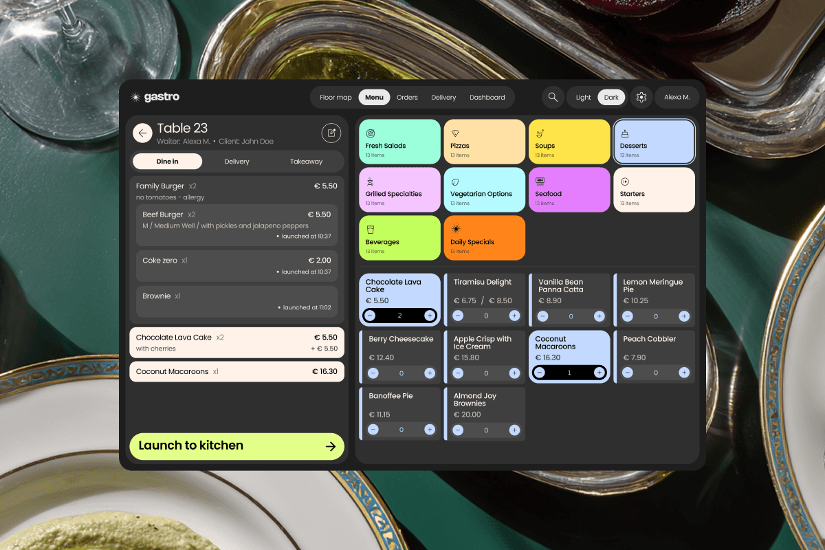
"Guided Modals" for Complex Bundles.
Complex items (like a Burger Meal) create cognitive overload. I designed a Guided Modal pattern. When a bundle is triggered, the screen focuses entirely on the sequence: Burger -> Temp -> Side -> Drink. A persistent "Live Summary" updates in real-time, acting as a memory anchor so the waiter never has to remember what they just tapped.
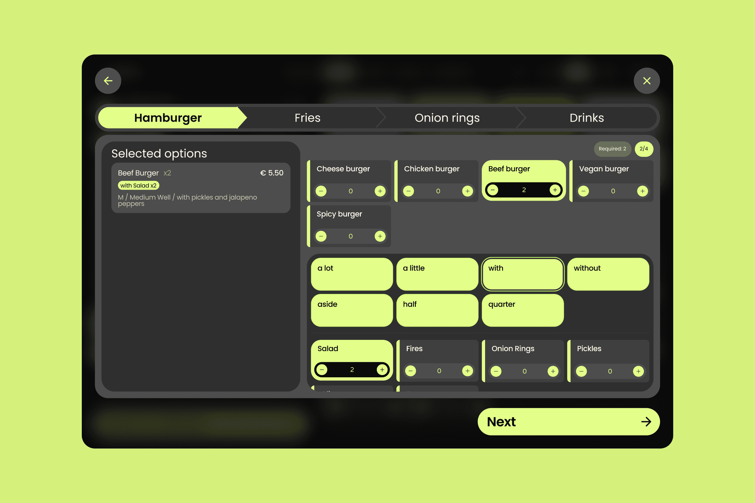
"Fire Selected" & Kitchen Pacing
Waiters often enter a full order but need to pace the meal. The old system just had "Send." I introduced "Fire Selected." This allows staff to input mains but only "Fire" the appetizers to the kitchen printer. I also redesigned the printed ticket typography ("The Bon") to ensure the high-stress kitchen staff could scan modifications instantly.
Guerrilla Research Strategy
We had a major constraint: zero direct access to end-users. I couldn't rely on assumptions, so I conducted Guerrilla Field Research. I visited client restaurants during off-peak hours to shadow waitstaff. Seeing them work in the field provided the undeniable evidence needed to pivot the product strategy.